
Pop Art 1950 – 1975
Streamline Moderne 1945 -1985
As the Great Depression of the 1930s progressed, Americans saw a new aspect of Art Deco, i.e., streamlining, a concept first conceived by industrial designers who stripped Art Deco design of its ornament in favor of the aerodynamic pure-line concept of motion and speed developed from scientific thinking.
The cylindrical forms and long horizontal windowing in architecture may also have been influenced by constructivism, and by the New Objectivity artists, a movement connected to the German Werkbund. The Streamline Moderne was sometimes a reflection of austere economic times; sharp angles were replaced with simple, aerodynamic curves, and ornament was replaced with smooth concrete and glass.

The style was the first to incorporate electric light into architectural structure. In the first-class dining room of the SS Normandie, fitted out 1933–35, twelve tall pillars of Lalique glass, and 38 columns lit from within illuminated the room.

The Strand Palace Hotel foyer (1930), preserved from demolition by the Victoria and Albert Museum during 1969, was one of the first uses of internally lit architectural glass, and coincidentally was the first Moderne interior preserved in a museum.
In America in particular Streamline Moderne appeared most often in buildings related to transportation and movement, such as bus and train stations, airport terminals, roadside cafes, and port buildings. It had characteristics common with modern architecture, including a horizontal orientation, rounded corners, the use of glass brick walls or porthole windows, flat roofs, chrome-plated hardware, and horizontal grooves or lines in the walls. They were frequently white or in subdued pastel colors.
An example of this style is the Aquatic Park Bathhouse in the Aquatic Park Historic District, in San Francisco. Built beginning in 1936 by the Works Progress Administration, it features the distinctive horizontal lines, classic rounded corners railing and windows of the style, resembling the elements of ship. The interior preserves much of the original decoration and detail, including murals by artist and color theoretician Hilaire Hiler. The architects were William Mooser Jr. and William Mooser III. It is now the administrative center of Aquatic Park Historic District.
The Normandie Hotel in San Juan, Puerto Rico, which opened during 1942, is built in the stylized shape of the ocean liner SS Normandie, and displays the ship’s original sign. The Sterling Streamliner Diners in New England were diners designed like streamlined trains.
Although Streamline Moderne houses are less common than streamline commercial buildings, residences do exist. The Lydecker House in Los Angeles, built by Howard Lydecker, is an example of Streamline Moderne design in residential architecture. In tract development, elements of the style were sometimes used as a variation in postwar row housing in San Francisco’s Sunset District.
The defining event for streamline moderne design in the United States was the 1933–34 Chicago World’s Fair, which introduced the style to the general public. The new automobiles adapted the smooth lines of ocean liners and airships, giving the impression of efficiency, dynamism, and speed. The grills and windshields tilted backwards, cars sat lower and wider, and they featured smooth curves and horizontal speed lines. Examples include the 1934 Chrysler Airflow and the 1934 Studebaker Land Cruiser. The cars also featured new materials, including bakelite plastic, formica, Vitrolight opaque glass, stainless steel, and enamel, which gave the appearance of newness and sleekness. [4]
In 1939 and 1941 respectively, both Chrysler and GM came out with pick-up and truck lines, that had both distinct and similar looking designs that submitted to the Art Deco and streamline styling en vogue in the day, under various brand names.
Other later examples include the 1950 Nash Ambassador “Airflyte” sedan with its distinctive low fender lines, as well as Hudson‘s postwar cars, such as the Commodore,[5] that “were distinctive streamliners—ponderous, massive automobiles with a style all their own”.[6]
Heroic & Social Realism 1931 – 1945
Heroic realism is art used as propaganda. Examples include the Socialist realism style associated with Communist regimes, and sometimes the similar art style associated with Fascism. Its characteristics are realism and the depiction of figures as ideal types or symbols, often with explicit rejection of modernism in art.
Both socialist art and Nazi art were explicitly ordered to be heroic, and were in consequence an ideal form of the real, rather than pure realism

Heroic realism designs were used to propagate the revolution in the Soviet Union during Lenin’s time. Lenin doubted that the illiterate population would understand what abstract visual images were intended to communicate. He also thought that artists, such as constructivists and productivists, may have had a hidden agenda against the government.
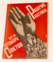
Stalin understood the powerful message which could be sent through images to a primarily illiterate population. Once he was in power, posters quickly became the new medium for educating illiterate peasants on daily life—from bathing, to farming, the posters provided visual instruction on almost everything. In 1931-2, the early emphasis on the “little man” and the anonymous labouring masses gave way to the “hero of labour”, derived from the people but set apart by the scale of his deeds. As a consequence, literature filled with “positive heroes” that were sometimes tedious.
In 1934, a new doctrine called Socialist realism came about. This new movement rejected the “bourgeois influence on art” and replaced it with appreciation for figurative painting, photography and new typography layouts. Writers were explicitly enjoined to develop “heroization.” At the Paris World Fair, Vera Mukhina’s Worker and Kolkhoz Woman exemplified the ideal New Soviet Man, depicting a man and woman in working clothes, with his hammer and her sickle crossed, in a monumental statue with both striding forward.

When Adolf Hitler came to power in Germany in 1933, modern art was condemned as degenerate, and largely prohibited. The Nazis promoted a style of art based on classical models, intended to nurture nationalism. Heroic realism was to inculcate values of sacrifice, duty, and devotion. The heroic man, who was bound to blood and soil, acted rather than thought and sacrificed himself. This particularly favored the heroic death.


Nazi theory explicitly rejected “materialism”, and therefore, despite the realistic treatment of images, “realism” was a seldom used term. A painter was to create an ideal picture, for eternity. The images of men, and still more of women, were heavily stereotyped, with physical perfection.

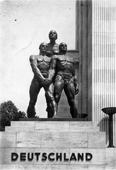
Arno Breker’s skill at this type of work made him Hitler’s favourite sculptor. At the Paris Exposition of 1937, Josef Thorak’s Comradeship stood outside the German pavilion, depicting two enormous nude males, clasping hands and standing defiantly side by side, in a pose of defense and racial camaraderie.
Art Deco 1925 -1945

Art Deco, is a style of visual arts, architecture and design that first appeared in France just before World War I. Art Deco influenced the design of buildings, furniture, jewelry, fashion, cars, movie theatres, trains, ocean liners, and even everyday objects such as radios and vacuum cleaners.


It took its name, short for Arts Décoratifs, from the International Exhibition of Modern Decorative and Industrial Arts held in Paris in 1925. It combined modern styles with fine craftsmanship and rich materials. During its heyday, Art Deco represented luxury, glamour, exuberance, and faith in social and technological progress.


Art Deco was a pastiche of many different styles, sometimes contradictory, united by a desire to be modern. From its outset, Art Deco was influenced by the bold geometric forms of Cubism and the Vienna Secession; the bright colors of Fauvism and of the Ballets Russes; the updated craftsmanship of the furniture of the eras of Louis Philippe I and Louis XVI; and the exotic styles of China and Japan, India, Persia, ancient Egypt and Maya art.
It featured rare and expensive materials, such as ebony and ivory, and exquisite craftsmanship. The Chrysler Building and other skyscrapers of New York built during the 1920s and 1930s are monuments of the Art Deco style.

In the 1930s, during the Great Depression, Art Deco became more subdued. New materials arrived, including chrome plating, stainless steel, and plastic. A sleeker form of the style, called Streamline Moderne, appeared in the 1930s; it featured curving forms and smooth, polished surfaces. Art Deco is one of the first truly international styles, but its dominance ended with the beginning of World War II and the rise of the strictly functional and unadorned styles of modern architecture and the International Style of architecture that followed.
New Typography 1925 – 1970

According to Richard Hollis in his book Swiss Graphic Design. The Origins and Growth of an International Style, 1920-1965 says Modern design began in the nineteenth century with artists looking for a new role in industrialised society. It wasn’t until after the First World War these artists brought about a revolution in the design of print.
This style was introduced as New Typography which stopped using ornament and drawn illustration and in came white space plain letterforms and photographs. (Hollis, 2006).
The International Typographic Style, also known as the Swiss Style, is a graphic design style that emerged in Russia, the Netherlands, and Germany in the 1920’s and was further developed by designers in Switzerland during the 1950s and became the foundation for many of the graphic styles in the world by the 1970’s
The style took references and elements from Bauhaus, De Stijl and New Typography and these were used to great effect in the works of the pioneers of Swiss Style.
The style began from an aspiration to represent information objectively, free from the influence of associated meaning. The International Typographic style evolved as a modernist graphic movement that sought to convey messages clearly and in a universally straightforward manner. [reference]
It consisted of a grid which provided a skeleton that enabled designers to construct designs that consisted of an overall orderly and unified structure. They also used sans serif typefaces set in a flush left and ragged right format and used large black and white photography as a source for imagery rather than drawn illustrations because of its ability to make a true record of the subject.
The overall style ensured that the designs created were simple, tightly structured and easy to read. These grids are still in use today in both poster design, publishing and web design.
This graphic design technique based on grid-work that began in the 19th century became the basis for the development of the foundation course at the Basel School of Design in 1908. Ten years later Ernst Keller a pioneer of the style became a professor at the Kunstgewerbeschule (School of Arts and Crafts) in Zurich and began developing a graphic design and typography course.
Keller did not teach a specific style to his students, but rather taught a philosophy of style that dictated “the solution to the design problem should emerge from its content.” This idea was a reaction to previous artistic processes that focused on “beauty for the sake of beauty” or “the creation of beauty as a purpose in and of itself”. [reference]
Keller’s work used simple geometric forms, vibrant colours and evocative imagery to reinforce the meaning behind each design.


After the Second world war the Swiss style was refined at two design schools in Switzerland, one in Basel led by Armin Hofmann and Emil Ruder, and the other in Zurich under the leadership of Joseph Muller-Brockmann. Both had studied with Ernst Keller at the Zurich School of Arts and Crafts before WWII, where the principles of the Bauhaus and Jan Tschichold’s New Typography were taught.
The new style became widely synonymous with the “look” of many Swiss cultural institutions which used posters as advertising vehicles. Hofmann’s series for the Basel State Theatre and Muller-Brockmann’s for Zurich’s Tonhalle are two of the most famous.


After World War II international trade began to increase and relations between countries grew steadily stronger. Typography and design were crucial to helping these relationships progress using clarity, objectivity, region-less glyphs, and symbols became essential to communication between international partners. International Typographic Style found its niche in this communicative climate and expanded further beyond Switzerland, to America. The emigration of the German Bauhaus school of design to Chicago in 1937 brought a “mass-produced” minimalism to America.
Notable names in mid-century modern design include Adrian Frutiger, designer of the typefaces Univers and Frutiger; Paul Rand, who, from the late 1930’s until his death in 1996, took the principles of the Bauhaus and applied them to popular advertising and logo design, helping to create a uniquely American approach to European minimalism while becoming one of the principal pioneers of the subset of graphic design known as corporate identity; and Josef Müller-Brockmann, who designed posters in a stark yet accessible manner typical of the 1950s and 1960s.

The new style was perfectly suited to the increasingly global post war marketplace. Corporations needed international identification and global events such as the Olympics called for solutions which the Typographic Style could provide.
The 1950s the introduction of International Typographic Style elements into sans-serif font families such as Univers came about. Univers paved the way for Max Miedinger and collaborator Edouard Hoffman to design the typeface Neue Haas Grotesk, which would be later renamed Helvetica.
The story of Helvetica began in the autumn of 1956 in the small Swiss town of Münchenstein. This is where Eduard Hoffmann, managing director of the Haas Type Foundry, commissioned Max Miedinger to draw a typeface that would unseat a popular family offered by one his company’s competitors.
Miedinger, who was an artist and graphic designer came up with a design based on Hoffmann’s instructions, and by the summer or 1957, produced the new sans serif typeface which was given the name “Neue Haas Grotesk.” Simply translated this meant “New Haas Sans Serif.”
The Stempel type foundry, which was the parent company of Haas, decided to offer the design to its customers in Germany, where Stempel was based. The company, however, felt it would be too difficult to market a new face under another foundry’s name and looked for one that would embody the spirit and heritage of the font. The two companies settled on “Helvetica,” which was a close approximation of “Helvetia,” the Latin name for Switzerland. (https://www.fonts.com/font/linotype/helvetica/story) 2020.
The goal with Helvetica was to create a pure typeface that could be applied to longer texts and that was highly readable. The typeface was first used in a periodical publication in 1959 titled “New”
The format of the journal represented many of the important elements of the style and was published internationally, therefore spreading the movement beyond Switzerland’s borders.
One of the first American designers to integrate Swiss design with his own was Rudolph de Harak. The influence of International Typographic Style on his works can be seen in his many book jacket designs for McGraw-Hill publishers in the 1960s.


Each jacket shows the book title and author, often aligned with a grid—flush left, ragged-right. One striking image covers most of the jacket illustrating the theme of the particular book.
From the early 60s International Typographic Style was embraced by corporations and institutions in America and has been used effectively for the past sixty years.
Helvetica has been and continues to be the typographical choice for many international corporations and government departments. They use it because of its easy to read and has become an intrinsic part of their brand communication.
Bauhaus 1919 – 1923

Manifesto of the Staatliches Bauhaus
Walter Gropius, April 1919
“Architects, sculptors, painters – we must return to craftsmanship! For there is no such thing as “art by profession”. There is no essential difference between the artist and the artisan”.
“The artist is an exalted artisan. Merciful heaven, in rare moments of illumination beyond man’s will, may allow art to blossom from the work of his hand, but the foundations of proficiency are indispensable to every artist. This is the original source of creative design”.
“So let us therefore create a new guild of craftsmen, free of the divisive class pretensions that endeavoured to raise a prideful barrier between craftsmen and artists! Let us strive for, conceive and create the new building of the future that will unite every discipline, architecture and sculpture and painting, and which will one day rise heavenwards from the million hands of craftsmen as a clear symbol of a new belief to come”.
This was the central driver of the Bauhaus movement.
Founder Walter Gropius’ form-follows-function philosophy transformed advertising, typography, architecture, people’s living spaces, and the public’s aesthetic expectations in fundamental ways.
The Bauhaus mission – to provide affordable, artistic, utilitarian design for every class of person – was a huge success.
Even today, their designs still appear crisp, their geometric style is reflected in successful design everywhere: from billboards to infographics. And it still serves its original purpose: to honour functionality with beauty, to please the eye and capture the mind.
They had six principles that they based all of their work around
1 Form Follows Function
Everything made at the Bauhaus School was meant to embody one central tenet: form should always reflect and enhance function. Utility comes first.
The lesson: never sacrifice your message for your design. Focus on readability, narrative, and information first, artistic flair and frills second. Use your design to reinforce your message, never the other way around.
2. There is Always a Connection Between Colour and Shape
One of the school’s most famous thinkers and artists, Wassily Kandinsky, strove for a universal aesthetic: a visual style that would transcend cultural differences and language barriers. He believed certain shapes and colours complemented each other and communicated a specific idea or emotion to the viewer.
For example, he believed yellow and the triangle were natural partners: they strengthen each other’s sharpness. He tested his students on this theory, presenting them with a circle, square, and triangle alongside the colours red, blue, and yellow (blue, a spiritual colour, corresponded with the circle while red, an earthbound colour, corresponded with the square.)

3. Clean, Powerful Typography Matters
In the world of graphic design, typography is perhaps the Bauhaus’ great legacy. For the Bauhaus, the words were an integral graphic element.
They were architectural — like a chair in a room — functioning on their own, as words, and as artistic tools in the space.
Bauhaus typographers were pioneers of wrapping text, and of setting words at sharp angles. But again, the meaning of the words always came first, clever design second.

4. You Don’t Have to Abolish Capital Letters, But Sometimes It Helps
Like Kandinsky’s universal aesthetic, Herbert Bayer’s universal alphabet was designed to foster communication. At the time of its invention, almost all of Germany’s printed text was in Fraktur: a strange, antiquated, difficult-to-read typeface; a remnant of an age when monks and scholars published manuscripts for other monks and scholars. You’re probably familiar with Fraktur.
Fraktur represented the opposite of the Bauhaus ideal. Its ornate illegibility reflected the elitism of old-fashioned German intellectual culture. It was a typeface for the upper classes. In stark contrast, Bayer’s universal alphabet was all lower-case and sans serif: simple and legible. It was a typeface for everyone.
Share and Collaborate
The Bauhaus was founded on collaboration. Even though its founders and teachers were all giants in their fields, they also all served a greater purpose: design enlightenment. Not that there weren’t disagreements, but they managed to achieve an openness and collaborative style few groups of artists ever have. Their timelessness is a testament to that.

Imitation is the Highest Form of Flattery:
The Bauhaus is Everywhere
Art is a continuum of great ideas. Many of the best ones have been done before, but you can always frame those ideas in new ways.
Even if you didn’t know anything about the Bauhaus before today, you probably recognize the look. It’s a cultural eye-worm and for good reason: it works.

On the morning of April 11 1933, the architect Ludwig Mies van der Rohe turned up for work as normal. It was not a normal day. The Bauhaus, the 20th century’s greatest school of art, architecture and design, was closed. The building was cordoned off by armed police and surrounded by crowds.
Mies’ pace quickened. “Stop!” he shouted at the officers. “What’s the idea? This is my school! It belongs to me!” Not any more, said an officer: the Gestapo was scouring the school for a secret printing press suspected of publishing anti-Nazi propaganda, and documents linking Bauhaus to the Communist party. Mies was released after an interrogation. But the Bauhaus stayed shut.
Mies briefly moved the school to Berlin, but the leftist politics and Jewish persuasion of many Bauhaus artists made it a prime target for the Nazis, who furthermore saw the school’s internationalist philosophy as “anti-German.” Several Bauhaus artists were arrested and killed by the Nazis; others fled to exile in America.
Walter Gropius considered himself a patriotic German. He was not Jewish. He was not forced to leave the country. But the Nazi regime negated all that he believed in and the artistic freedoms he had worked for. His avant-garde associations and close connections with people the Nazis considered “degenerate artists” left him little choice but to emigrate. His wife Ise later commented that if he had stayed in Germany Gropius would have been sent to a concentration camp.
In 1934 he made a hurried departure for Britain via Rome. For the next 30 years he lived in exile. Meanwhile the Bauhaus had made a last move to Berlin, where, under pressure from the Nazis, it finally closed down. In 1933, stormtroopers invaded the school and rounded up students for interrogation.
Dada 1915- 1924
Dada artists felt the war called into question every aspect of a society capable of starting and then prolonging it – including its art. Their aim was to destroy traditional values in art and to create a new art to replace the old. As the artist Hans Arp later wrote:
Revolted by the butchery of the 1914 World War, we in Zurich devoted ourselves to the arts. While the guns rumbled in the distance, we sang, painted, made collages and wrote poems with all our might.
Hans Arp
In addition to being anti-war, dada was also anti-bourgeois and had political affinities with the radical left. The founder of the movement was a writer, Hugo Ball.
In 1916 he started a satirical night-club in Zurich, the Cabaret Voltaire, and a magazine which, wrote Ball, ‘will bear the name ”Dada”. Dada, Dada, Dada, Dada.’ This was the first of many dada publications. Dada became an international movement and eventually formed the basis of surrealism in Paris after the war.
Leading artists associated with it include Hans Arp, Marcel Duchamp, Francis Picabia and Kurt Schwitters. Duchamp’s questioning of the fundamentals of Western art had a profound subsequent influence.


De Stijl 1917 – 1924
De Stijl Dutch for “The Style”, also known as Neoplasticism, was a Dutch art movement founded in 1917 in Leiden and consisted of artists and architects.
De Stijlis is a term used to refer to a body of work from 1917 to 1931 from a group founded in the Netherlands. Proponents of De Stijl advocated pure abstraction and universality by a reduction to the essentials of form and colour; they simplified visual compositions to vertical and horizontal, using only black, white and primary colors.

Piet Mondrian Composition with Red, Blue and Yellow 1930 
Vilmos Huszar , Skaters 1917 
Bart van Der Leck Still life (Bowl with apples) 1921
De Stijl is also the name of a journal that was published by the Dutch painter, designer, writer, and critic Theo van Doesburgthat served to propagate the group’s theories. Along with van Doesburg, the group’s principal members were the painters Piet Mondrian, Vilmos Huszár, Bart van der Leck, and the architects Gerrit Rietveld, Robert van ‘t Hoff, and J. J. P. Oud.
The artistic philosophy that formed a basis for the group’s work is known as Neoplasticism—the new plastic art (or Nieuwe Beelding in Dutch). According to Theo van Doesburg in the introduction of the magazine “De Stijl” 1917 no.1, the “De Stijl”-movement was a reaction to the “Modern Baroque” of the Amsterdam School movement (Dutch expressionist architecture) with the magazine “Wendingen” (1918–1931).
Russian Constructivism 1913 -1934
Constructivism was an artistic and architectural philosophy that originated in Russia beginning in 1913 by Vladimir Tatlin. This was a rejection of the idea of autonomous art. He wanted ‘to construct’ art. The movement was in favour of art as a practice for social purposes.
Constructivism had a great effect on modern art movements of the 20th century, influencing major trends such as the Bauhaus and De Stijl movements. Its influence was widespread, with major effects upon architecture, sculpture, graphic design, industrial design, theatre, film, dance, fashion and, to some extent, music.
The term Construction Art was first used as a derisive term by Kazimir Malevich to describe the work of Alexander Rodchenko in 1917. Constructivism first appears as a positive term in Naum Gabo’s Realistic Manifesto of 1920. Aleksei Gan used the word as the title of his book Constructivism, printed in 1922.

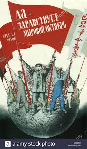
In 1919 Beat the Whites with the Red Wedge by El Lissitzky, repurposed abstract Suprematist motifs as war propaganda. The lithograph shows a huge red triangle that pierces into a white circle, which creates the center of attention. The red wedge symbolized the revolutionaries, who were penetrating and killing the anti-Communist White Army. The white background depicts a bright future.
The Constructivists rejected the idea of art being autonomous from the rest of society, to them, all art and design was a political tool. In short, Russia was their canvas, the building of the new Soviet nation an art project of gigantic scale.
The issue initially was, how do we communicate with a population that was for the most part illiterate. That is were symbolism came into its own, enabling the Communist to give a clear message by symbolism.
By 1924 The government of the time saw the benefits of a population that could read and write Alexander Rodchenko and Varvara Stepanova’s famous Books! poster (1924) employs a stark grammar of simple geometry and flat colour to promote a campaign for worker education.


Later that year Lissitzky pioneered the collage of purely photographic images,many decades before Photoshop
This was probably the start of what we have come to know as Graphic design. The Constructivists applied this abstract visual grammar with remarkable consistency across a wide range of design disciplines.
Early Soviet graphic design consists of an unlikely mix of high avant-garde theory and political propaganda.
The Constructivist experiment was stopped in its tracks when government power struggles following the death of Lenin in 1924 ended in Stalin’s dictatorial rule.

The Stalinists considered the Constructivist aesthetic too rarefied to serve as an effective instrument of state propaganda, ruling that all future design should abide by the conservative neoclassical style of Socialist Realism.
Constructivist designers who refused to co-operate retired from public life, fled Russia, or received a visit from state police in the early hours of the morning and ended up in the Gulag.
During the days of Stalin, one wrong word could end with the secret police at your door, ready to drag you off to a Soviet gulag – one of the many forced labour camps where inmates worked until they died. Historians estimate that nearly 14 million people were thrown into a gulag prison during Stalin’s reign. The families of priests, professors, and important figures would be rounded up and sent off to the work camps, keeping them out of the way while the Soviet Union systematically erased their culture.

Gustav Klutsis One of the pioneers of Soviet propaganda graphic design was particularly prominent for his revolutionary use of photomontage to create political posters, book designs, newspaper and magazine illustrations.
Starting from 1929 he worked on the Struggle for a Five-Year Plan series of photomontages and posters that would become classics of Soviet design just like his earlier Lenin series. His works of this period often combine methods of posed photography, reportage and double-exposure images.
By the mid 1930s he was one of the leading exponents of propaganda art, however his relationship with the authorities was gradually deteriorating, particularly with IZOGIZ, the Soviet publisher of mass propaganda. The last major exhibition he participated in and helped to organize was the Soviet Pavilion at the 1937 Paris World Exhibition.

Like so many others, on 17 January 1938, Klutsis was secretly arrested and had disappeared into a system of paranoia and repression. The creativity that marked his life stood in stark contrast to an oppressive state and those two ideas could not coexist for very long. It was not until 1989 that the records of Klutsis’s assassination were revealed
